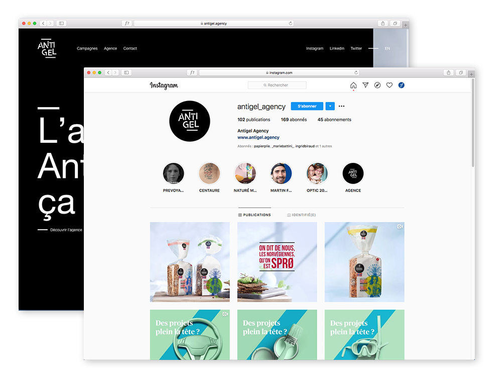
Antigel logotype
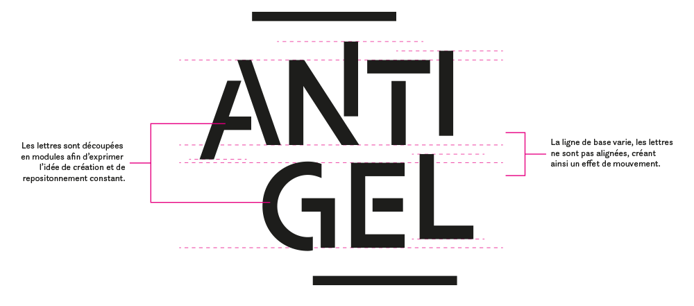
Logotype redesign of Antigel communication agency. The goal was to create a new logo to reflect what characterizes it: its ability to constantly adapt, question itself, reposition itself so as never to remain frozen. The letters of the logo are made up of different shapes that appear to be being assembled. Beyond its compact size ideal for use on social networks, it offers potential for animation.
Motion: Antigel


![]()