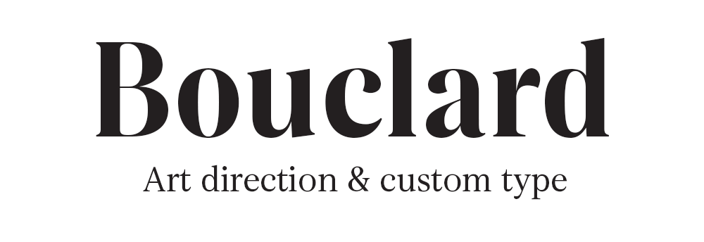
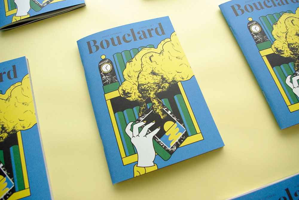
Bouclard N°1
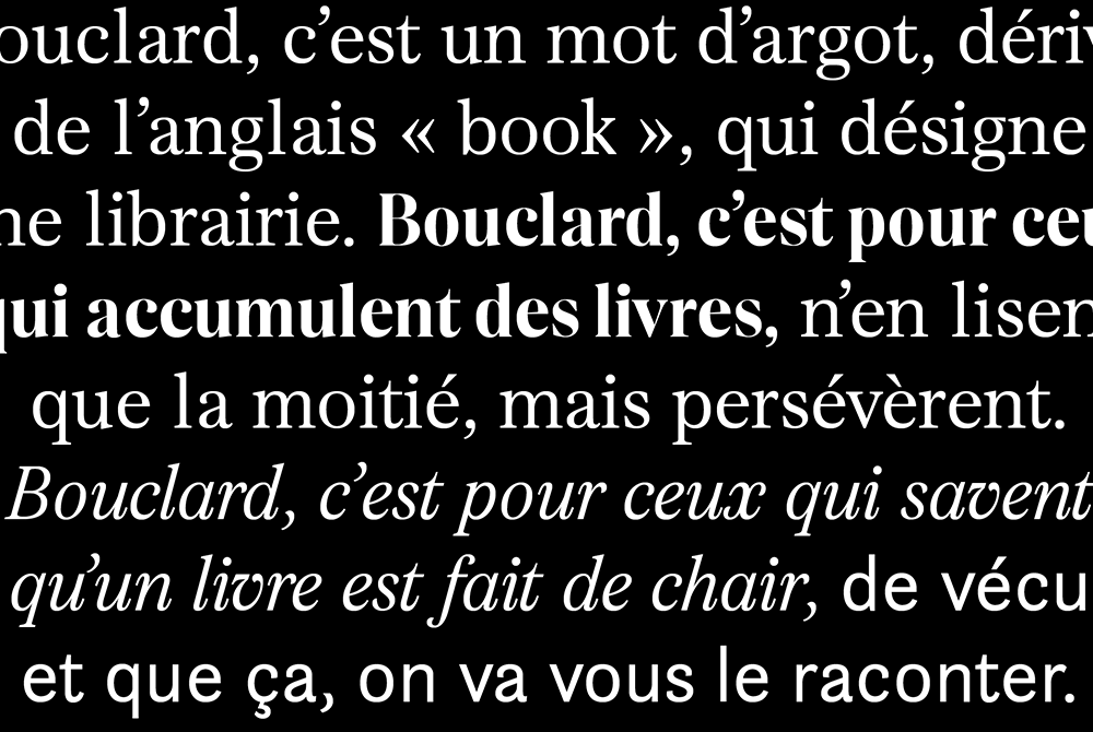
Bouclard is a publishing house in Nantes (France), its first born is the number 1 of a biannual literary magazine: Bouclard. This term comes from the English "book" and defined in slang a bookstore and by extension, a local business. I launched this review with my two partners: Benjamin Reverdy and Clément Le Priol, in this team, I am in charge of art direction and type design.
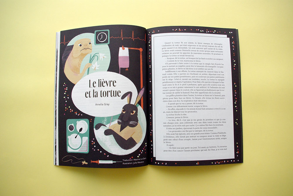
Cover illustration: Groduk + Boucar / "The bunny and the turtle" illustration Julia Wauters.
64p. / 23 x 17 cm / Cover: Freelife Vellum 215 gsm / Pages: Arcoprint Milk 120 gsm /four-color.

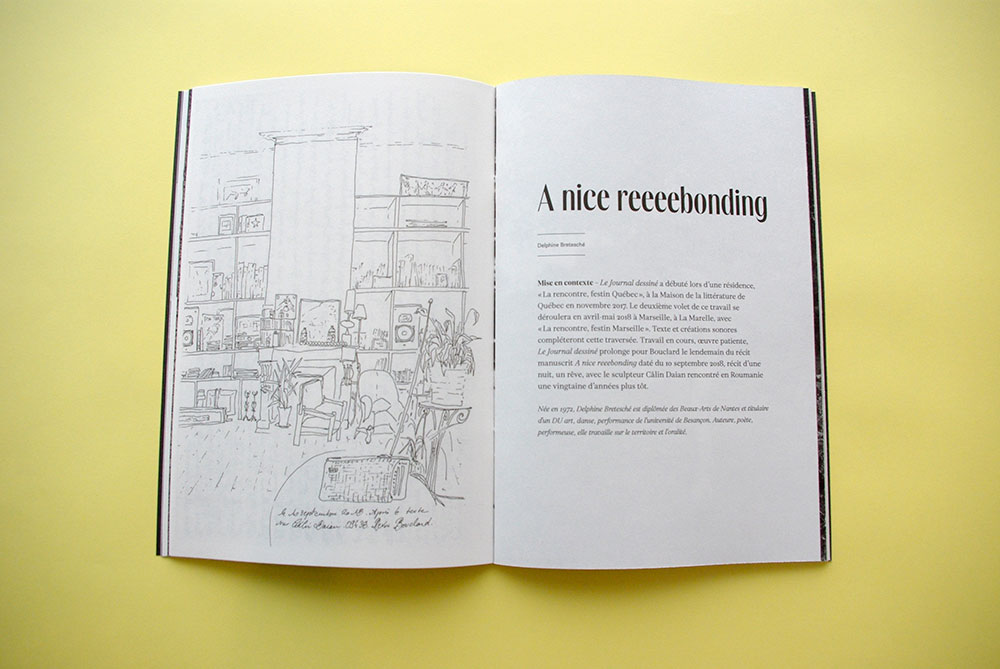
An airy layout
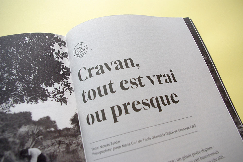
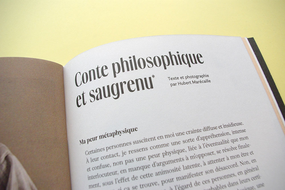
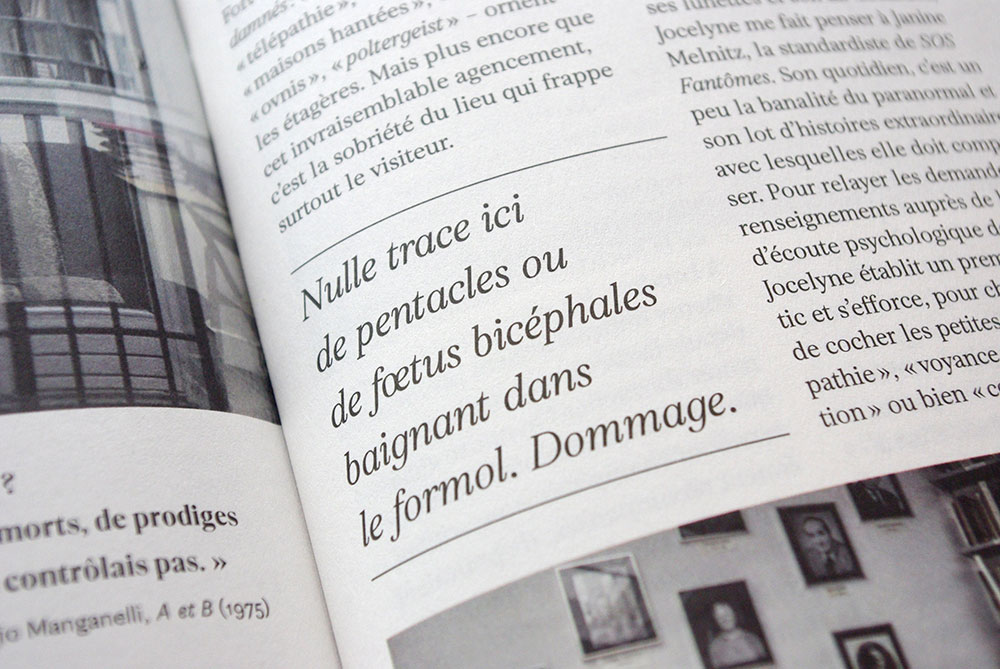
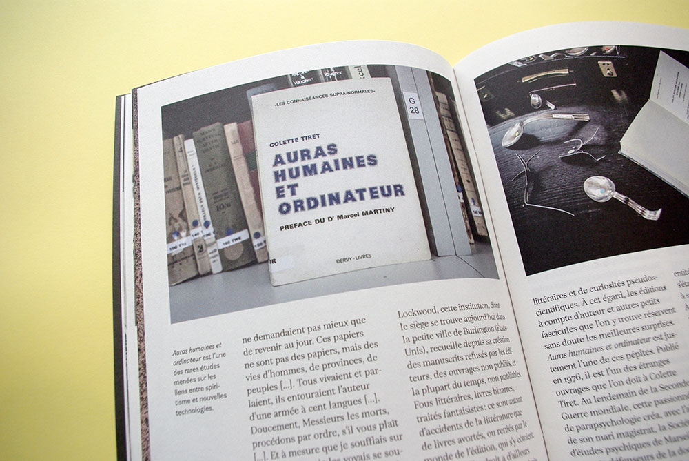
Bouclard is neither a book nor a magazine but a literary magazine, the place is left to the text with large margins and some beautiful pictures illustrating the topics, all printed on Arcoprint Milk 120 gsm (Fedrigoni) comfortable for reading.
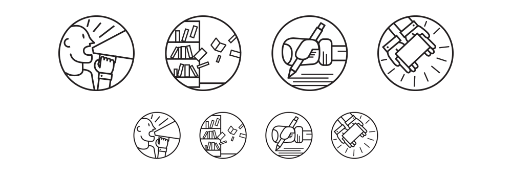
Specific pictograms
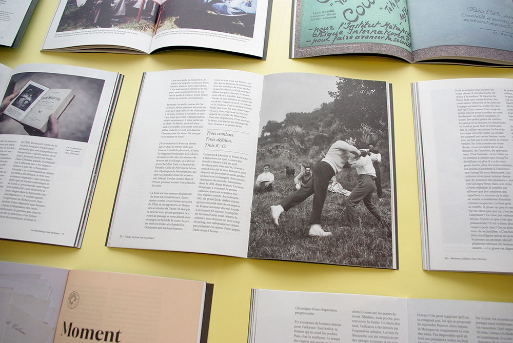
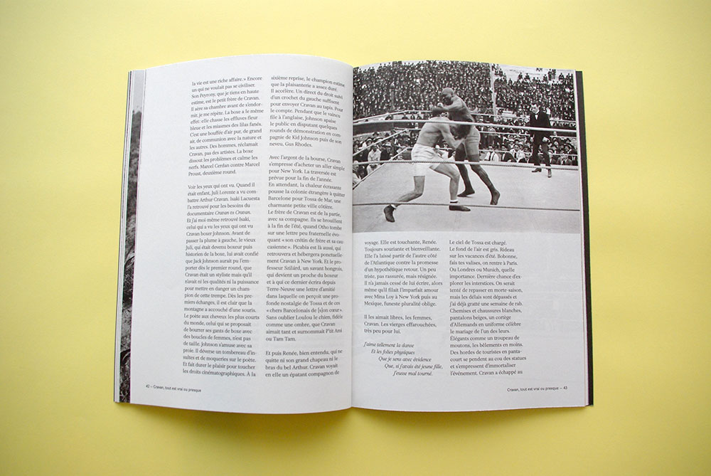
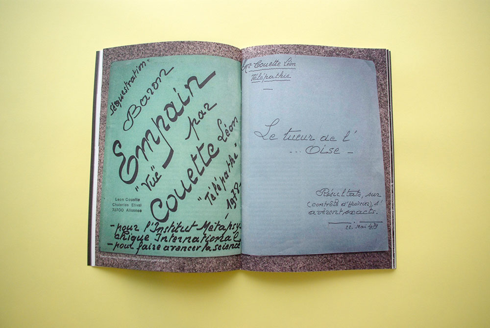
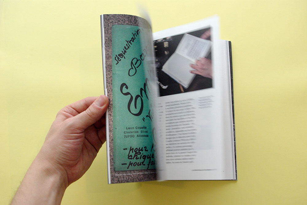
Specific pictograms have been designed to illustrate parts of the literary magazine, mainly the three long topics. From right to left: a pictogram for advertising, a subject on a paranormal library, a text on a poet/boxer: Arthur Cravan and finally an article on the gift of a dean of the Oulipo to Clémentine Mélois.
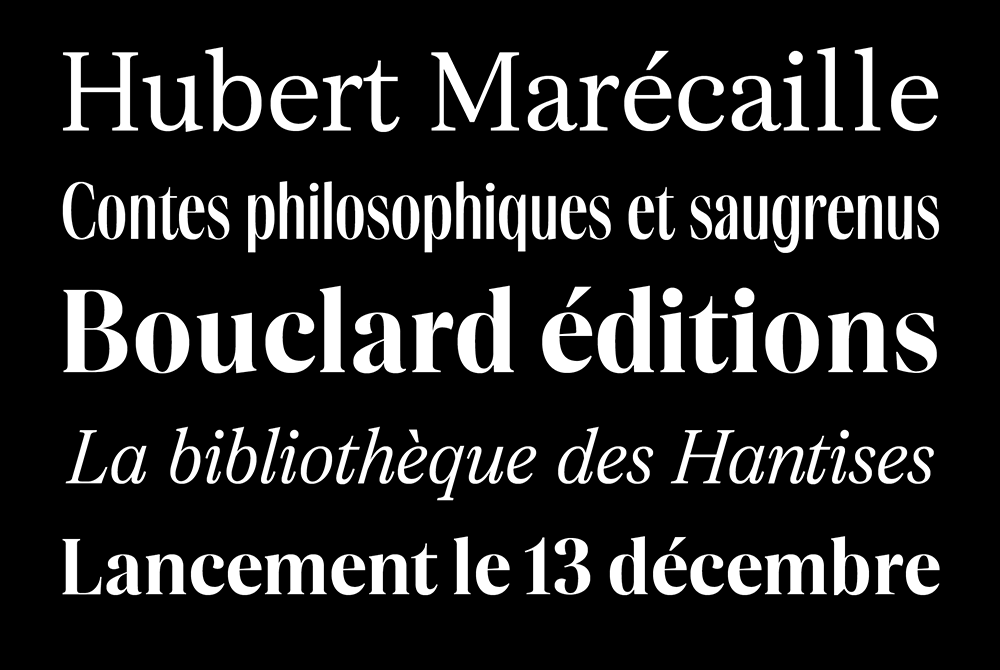
A custom typeface
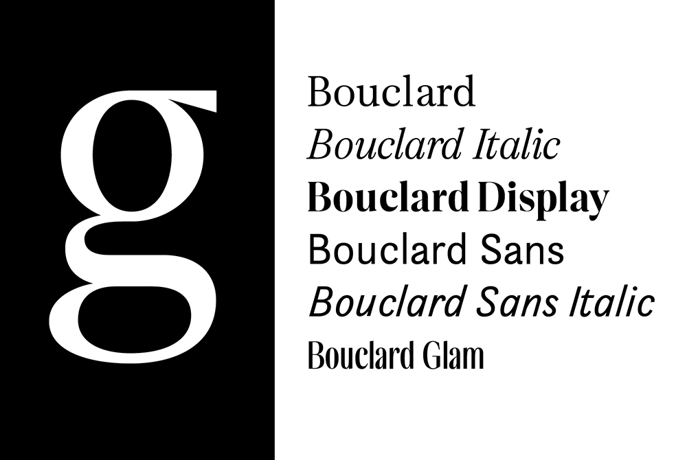
Very quickly, the question of custom type design raised, as it is central in the transmission of the text but also in the expression of what is the tone and identity of a magazine. The idea was to design an exclusive typeface with the same aesthetic logic but different styles to meet all our needs: logo, titles, intertitles, texts, quotes, legends ...
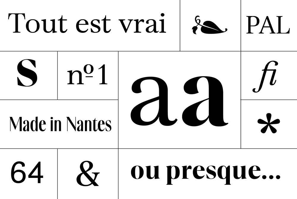
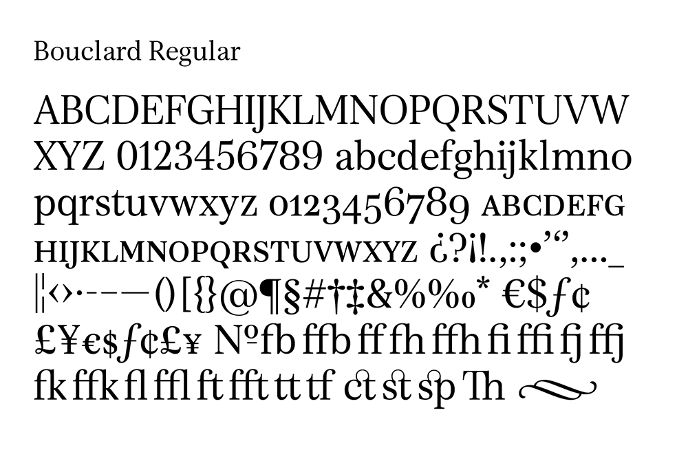
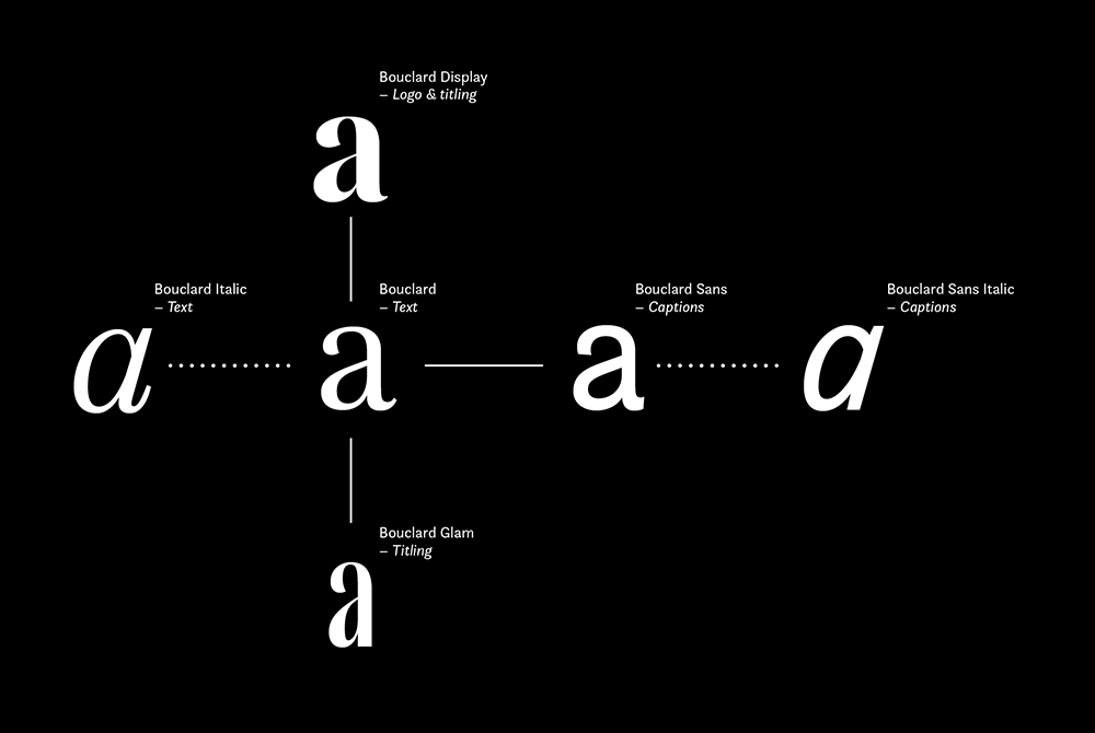
Bouclard: a big family
In order to have a flexibility and a freedom of tone, I imagined Bouclard as a "super-family", that is to say that I created variants from the same skeleton, from a same logic of design. The goal is to bring visual coherence to the journal while allowing us to play on different levels of reading and tones.