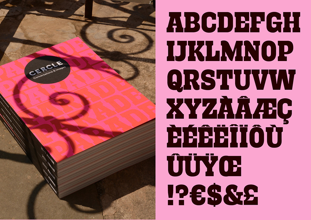
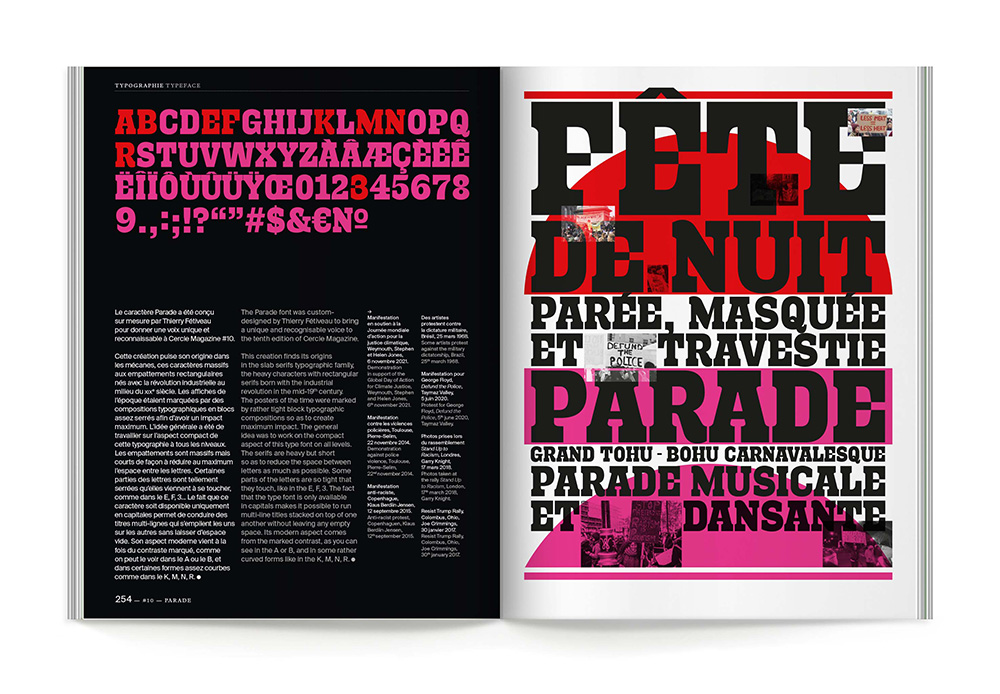
Parade
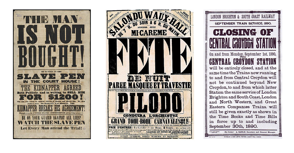
The typeface was custom-made for the magazine Cercle, which deals with this theme. The goal was to have a strong, print-ready typeface that saves space, as all the magazine's texts are written in both French and English. The common ground I perceived in the idea of ââparades (wedding, political, pride, military, etc.) is the idea of ââshowing off, of shouting something loud and clear. Drawing inspiration from 19th-century posters, which relied heavily on rather massive slab serif typefaces, I designed a thick, compact font where accents take up as little space as possible to conserve line spacing.