Andersen typeface: the making-of
While I was studiying graphic design, my final project was the typeface design for children's books. Its innovation lay in the creation of a complementary punctuation system. This typeface: Andersen, is now available at 205TF. Let's go behind the scene of a typographic creation.
CONCEPT & BRIEF
The starting point of my reflection was to decide a context of use, namely the children's literature. I first read hundreds of books from different publishing houses and for different age groups. This allowed me not only to make an inventory, but also to detect elements that could be improved.
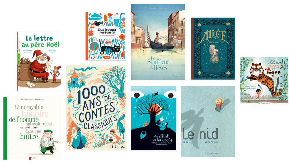
Part of the many references consulted.
The first observation is that even if there have been a lot of developments in recent years for illustration or printing, binding, the changes are less noticeable for typography. Regarding the typefaces used, I found there are too classic and not enough related to the world of childhood as Times New Roman, or more childish fonts but less effective for long text. So the idea was to look for an in-between. While making sure to differentiate some letters with similar shapes (b, d, q, q - 6, 9) for ease of reading to some children with difficulties in this area.
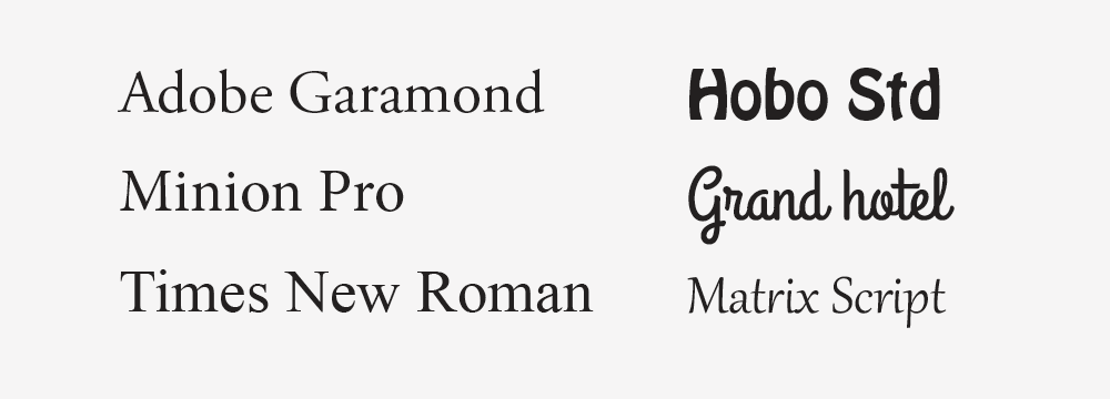
Typographies spotted quite frequently in the children literature.
The second observation is that by reading stories to the children aloud, we realize that sometimes the emotion, the intonation only happens at the end of the sentence, so we sometimes express too late, fear, sadness, anger... The idea would be to design signs evoking feelings and can be placed at the beginning and/or at the end of sentences to give the reader good intonation from the start.
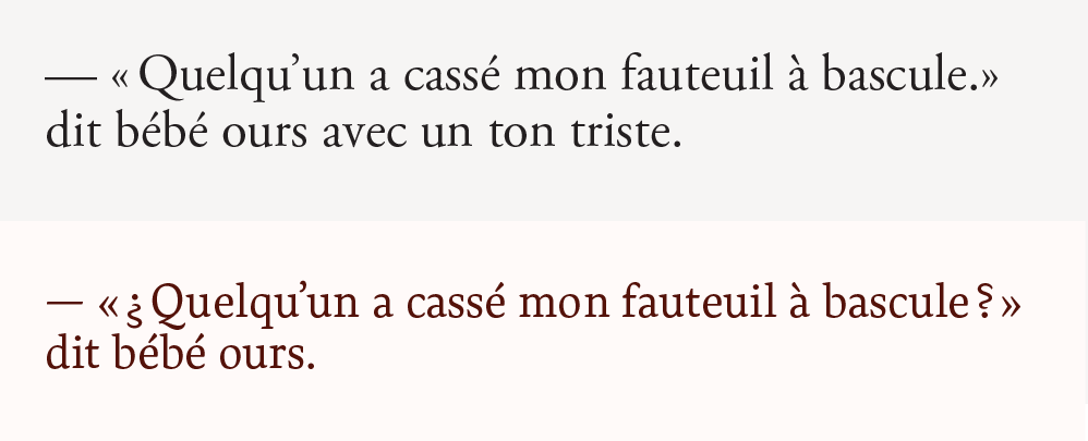
Top: Times New Roman, classic punctuation. / Bottom: Andersen and its feeling signs.
DESIGN
The starting point was to draw some key letters forming the word "vaphosie" which means nothing, but has the merit of giving central design elements for typography: proportions, contrast, serifs, terminals... Once these elements frozen, we can then develop the rest of the alphabet and all the glyphs with a software like Robofont.
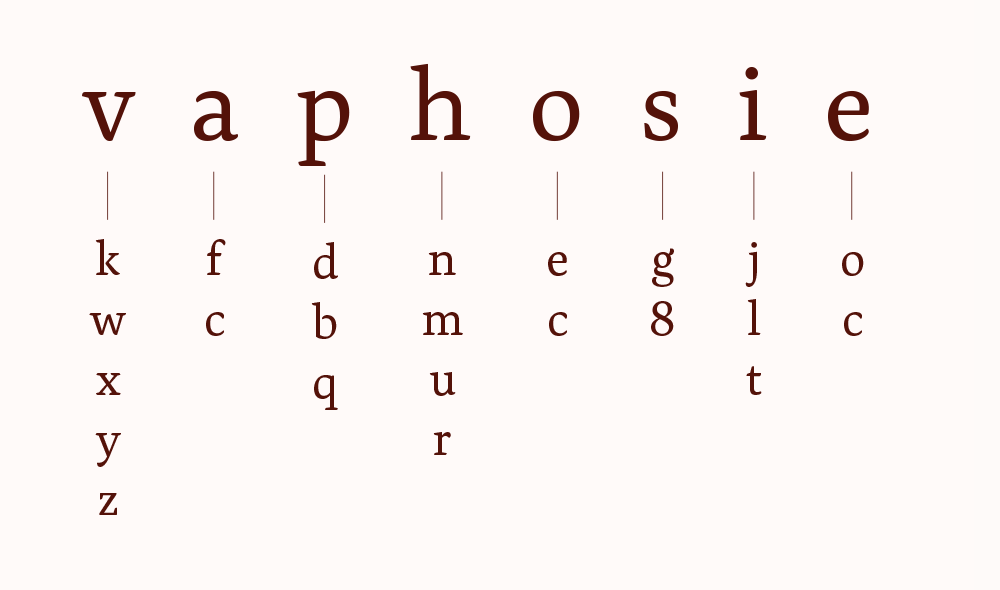
DEVELOPMENT
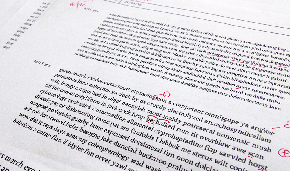
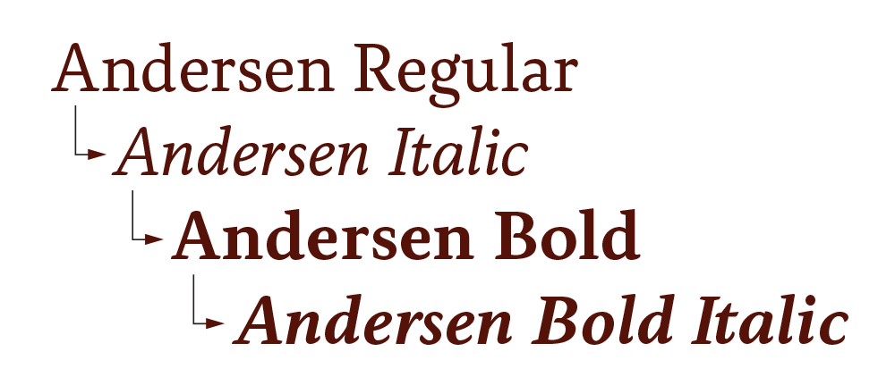
The development of the alphabet (which means the drawing of each glyph with the design decided) was then carried out with many printed tests to solve problems of drawing, proportions, spacing between letters. This for French, English, but also many other European languages (Spanish, Croatian, German, Hungarian, Icelandic)... Then, once all these elements validated, I switched to the development of other styles: Italic , Bold and Bold Italic.
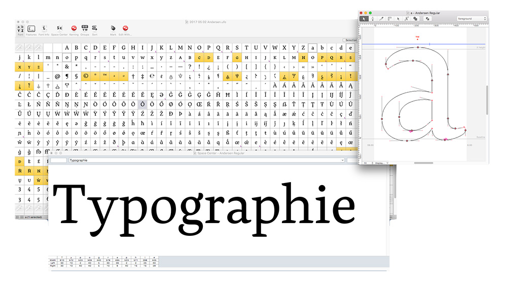
Robofont software windows allowing you to have a view of all the glyphs to draw, the detail of a letter in the form of vector shapes and the rendering of a word.
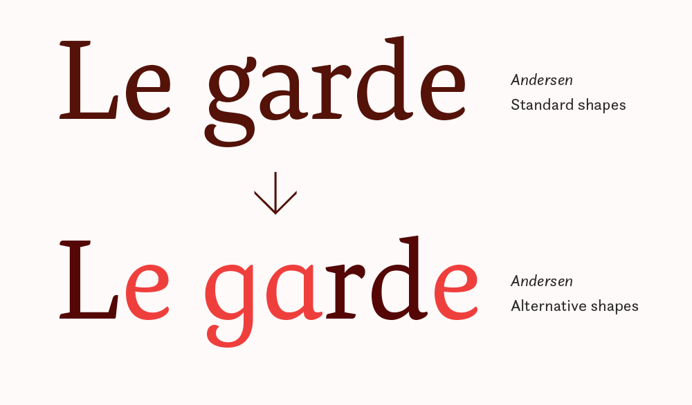
Since Andersen was designed for children books, I have created various OpenType functions that are lines of codes embedded in the typography, giving the user a wealth and flexibility of use. For example, I have created an alternative shape for the letters a, e and g, a kind of upright italic to get closer to the world of childhood.
The OpenType functions available in software like Indesign allow the user to have access to many features such as alternative forms, small capitals, indices and exponents, aligned or oldstyles figures ...
The main innovation of Andersen typeface was the addition of "feeling signs" that can be placed at the beginning or the end of the sentence telling the reader the right tone to read. These signs can be dialed directly threw keyboard shortcuts thank's to OpenType functions.
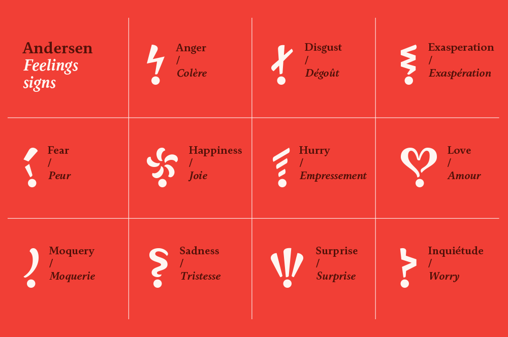
The 11 feeling signs of Andersen. The choice of these feelings was made after the analysis of the emotions returning most frequently in more than one hundred children's books.
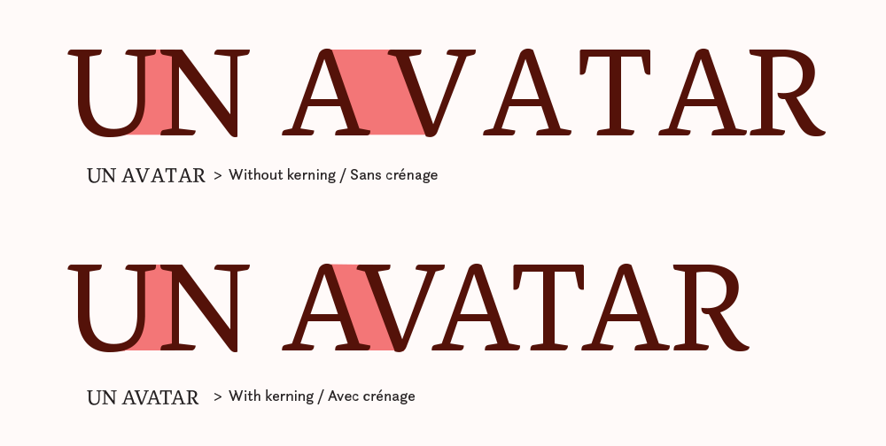
Finally, there is a final work to be done, once the drawing of the glyphs and their spacing are defined: kerning. The goal is to review all possible combinations of glyphs: capital + capitals, capitals + lowercase, lowercase + lowercase, capitals + punctuation ... And bring together certain signs (like A + V) or to move away from them some (f + ") for example, so this work is long and meticulous but necessary if one want the typography to work properly in any context. The 205TF foundry helped me a lot in this phase of corrections to optimize every detail.
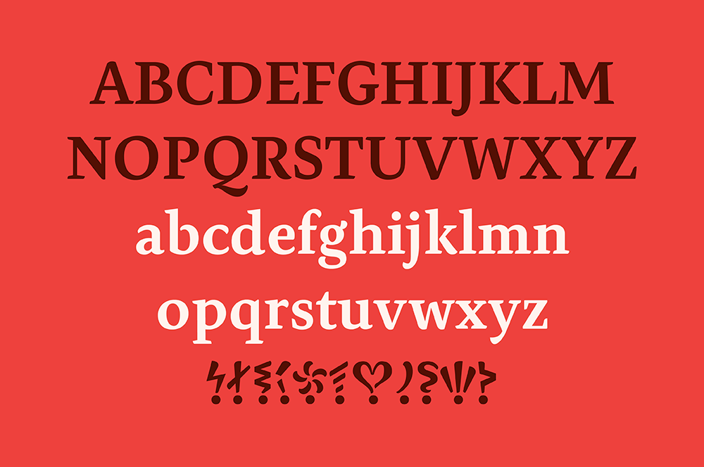
Now Andersen is finished and is available on the 205TF website. This work was quite long because it was my first text typeface in several weights but has taught me a lot and makes me willing to continue to design typefaces, "retail" (sold to a number of designers via a website) or custom (often exclusive typeface desgned for a client).
Text and pictures: Thierry Fétiveau – February, 2019. All rights reserved.
Further reading:The Open-Type cookbook
La fonderie 205TF
I love typography
Robofont
Adhesion text


